In what ways does your product use forms and conventions of real media products?
Our product uses the codes and conventions of real media products, it does not develop or challenge them because our aim was to produce a product that could rival a professional product.
Our documentary follows the conventions by :
Our documentary is easy to follow as the narrative structure is single strand and it is non linear.
Framing
- Framed in medium close up
- Vox Pop was framed so they were medium close up
- Pans (up, down and sideways) were used in cutaways
- Tracking shot through Liverpool is hand held and gives the impression of a point of view shot to position the audience in the action.
Framing our interviews so they look professional. We did this by framing the interviewee so their eyes were roughly 1/3 of the way down the screen and with them framed either to the left or right of the screen as shown below.
Proffessional
 Our documentary
  Graphics
We used graphics on two lines on the interviews to anchor who the interviewee is and their relevance to the subject matter.
Proffessional
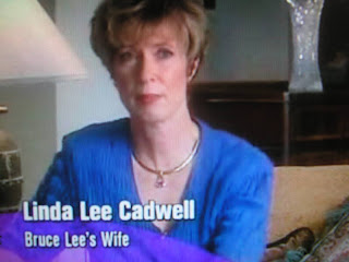
Our Documentary

Editing
- Fast motion during tracking shot through Liverpool
- Cuts to make the doc flow
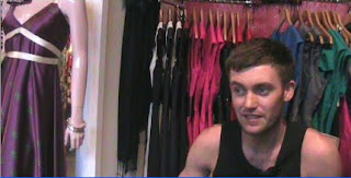
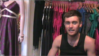
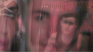
- Montage of Neil’s (the designer) shop
- Questions that were asked to the interviewee’s were edited out
- Fade to/ from black sometimes used to show end of a chapter.
We used cutaways to keep the audience entertained and to avoid jump cuts where the questions have been cut out and when the interviewee looks at the camera.
Sound
- Music, connotations of fashion (The Scissor Sister- Filthy Gorgeous, Madonna- Vogue and Christina Aguilera- Beautiful)
- Voiceover used frequently to link everything together, standard English and the age and gender relate to the target audience.
Mise en Scene
- Mise en scene related to the interviewee (Lisa’s- posters of her fashion influences and Neil’s- filmed in his clothes shop with the clothes that he designed and made hanging up in the background)
- Vox Pop was filmed in Liverpool City centre with shops behind the interviewees.

The title of our product is very unique and original and is associated with the questions in the programme

Handheld camera work is used for actuality footage when there is a tracking shot throught liverpool town centre
Cut is the most common edit in our documentary, however we did use fade to black and dissolves to show the ending of the previous part and the beginning of the next.
My product compares to real media products so that it could potenitally compete with other professional products. Therefore we followed the codes and conventions very well.
Question 2
How effective is the combination of the main tasks and the ancillary tasks?
Question 3
What have you learnt form your audience feedback?
We held a focus group of 20 people in which we presented our documentary, radio trailer and print advert. We then asked a few questions about each product to see where we could make any improvements to our work. I also shown individual people in my own time and interviewed them about it.
We took photographs of members of our focus group who had responeded to our questions.
Here are the questions we asked:
Does the opening of our documentary grab your attention?
In our focus group, 100% of them said yes it does grab their attention.
 Becky, 18- "It really grabbed my attention straight away, i loved the opening credits with the use of stop motion animation, if i had to say one weakness it would be that the tracking shot through liverpool was a bit too long and made me dizzy."
Joel, 19- "I loved it! It was all really creative."
What are the strengths and weaknesses of the documentary?
Someone we interviewed commented that the Vox pop was a strength because it was humorous.
They also said that they liked how the music linked with the visuals.
A lot of people commented that the fast motion at the start was a weakness because it was too fast, one person said ‘it hurt my eyes’. They also mentioned how they thought the transition in the music from the opening credits to the tracking shot was too loud when it should have been subtle.
Does it compare to a proffesional documentary? Why do yu think this?
In our focus group, 90% of them said it looked very proffesional
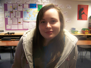
Rach, 18- "It looks exactly like a documentary that would be on tele"
Faye, 23- "The use of camera angles and the interviews looked really good"
John, 24- "It looked proffesional in some parts but the vox pop didn't seem like it was very good".
Some people thought that it did compare to professional documentaries because it linked well together, and the narrative followed a good order. They thought that it looked good as the camera shots were varied and they thought than the panning down and zooming in and out of the still images looked effective as it grabbed their attention.
Does the print advert make you want to watch the documentary?
In our focus group, 80% of them said yes it would

Heidi, 18- "Oh wow, thats amazing! I think its really creative and really makes me want to watch it".
Jenni, 22- "I would definately watch this, i love fashion and im studying it in uni so it would be interesting to watch this".
As soon as the print advert came up on the screen one person shouted ‘Oh my god that looks really good’. They then said that ‘It would make me want to watch the programme because it looks interesting and the title ‘Shabby Chic’ doesn’t reveal much about the programme, so I would want to find out more’. She also noticed that the bag gives hints to the content of the programme, but still doesn’t reveal much; therefore she wanted to find out more.
Does this Radio Trailer make you want to watch the programme? Why?
In our focus group, 70% of the people said yes.
Everyone agreed that the radio trailer was very original and that the extracts taken from the documentary were very funny.
One person said that it would make her want to watch the programme because the music was very uplifting and linked well with the subject matter. However in some parts she couldn’t make out what the voice over was saying. Therefore we made amendments to the radio trailer by adjusting the audio gain.
Would you want to watch the whole programme?
95% said that they would watch the rest of the programme
We also decided to collate more results on what people thought about our finished product.
Question 4

In my evaluation I have used Windows Movie maker to produce the video for question two. For this I recorded myself using my Dictaphone and edited it on Adobe Audition and then imported it onto windows movie maker to uploads relevant images onto it.
I have used Adobe Photoshop to gather images to show the shot types in both our production and professional productions. I have also used it to create a mood board to illustrate the equipment and programmes I have used.


 This is a thumbnail of Neil Cooper, a local fashion designer.


 Here is the final frame in the sequence.